Create an Online Booking System
for a medical clinic
Group Collaboration
Background
I collaborated with a team of five UX designers at Creative Navy to design an online medical booking system for a private hospital group, tailored specifically to their clinic needs.
We were provided the below brief.
Project Objective:
to design a mobile app that allows patients to book appointments online.
Client need:
provide patients a quick and efficient way to book (in under 10 minutes) and manage appointments with specialists that match their medical needs
develop a mobile app to replace the role of receptionists, automating the booking process.
Discovering problems
To uncover user preferences and pain points when making medical appointments or using online booking systems in general, we conducted a comprehensive user research. This allowed us to gain deeper insights into users needs and challenges.
Secondary Research
Fewer missed appointments (Paré et al. 2014; Zhao et al., 2017; Woodcock, 2021)
Widely used by deaf patients and carers (Atherton et al., 2014)
Less use in ethnic minorities and more deprived backgrounds (Atherton et al., 2014)
If no urgent available appointments - less use (Atherton et al., 2014)
Doctor’s main concern: handling the appointment length (Paré et al., 2014)
Reduced staff labour and costs (Woodcock, 2021)
User Interviews
What do think want/like?
Ability to choose doctor
Quickest booking process
“First Available Appointment”
Search by a particular criteria (e.g. close to work)
Do some research before booking
See availability clearly
Receive a confirmation email with all information
Competitor Analysis
We analysed existing booking systems across both the medical sector and other industries. This was to identify best practices to emulate and recognise common pitfalls to avoid, ensuring an optimal solution for our users.


Defining Users’ Problem
To guide us to focus solving specific needs of users, we drafted up a problem statement of our users after user research.
I am a busy parent of a young child and I am trying to book a medical appointment quickly using my subscription with the hospital. But currently I have to take time out of my working hours because I have to call the hospital during opening times to speak to a receptionist. This makes me feel frustrated and overwhelmed.
In order to further understand our user, we have worked on a empathy map, to help with empathising our users.

What comes next after user insights?
Before diving straight into creating solutions, it’s important to explore possibilities on our approach while keeping user problem at the centre of our focus.
Drafting up "How Might We" (HMW) statements are a powerful way to help us reframe user insights into opportunities and uncover innovative solutions based on research findings. (Anderson-Stanier, n.d.)
We created each HMW Questions according to business goals and users’ needs as below.
HMW Questions
HMW give enough flexibility for users to search for an appointment according to their priorities without overwhelming them with choices?
HMW provide sufficient information of each doctor for users to select?
HMW allow users to “first available” appointment efficiently?
HMW show the availability of appointments of each of the doctors?
HMW facilitate the communication between the users and doctors before the appointment? (T&C, info about cancellation, etc.)
HMW make the booking process less stressful?
HMW divert patients that are experiencing acute symptoms
HMW design the booking process to be inclusive and user-friendly for patients across different demographics, particularly older users?
Business Goals or Users’ Needs
Appointment to be booked under 1 min; users to be able to filter search results by their priorities
Users and CN (Creative Navy) want reviews and info of doctors to be visible
Users want to view the earliest available appointments
Users want to see availability from the doctor they want to book
CN want users to have all the info about prices, cancellations, etc. when an appointment is confirmed
Users currently find the booking process stressful
Both CN and secondary research aim to identify patients requiring urgent treatment to address safety concerns
CN would like the app to concern users from different demographic, i.e. older patients
Getting into ideation stage, as a team, each of us drafted several ideas for low-fidelity screens and proposed potential user flows to explore different options in our brainstorming session.
Developing Solutions Ideas

We reviewed each design, highlighted each pros and cons, discussed what could work and what couldn’t.
The screenshots above show our FigJam board, where we synthesized feedback from user interviews, secondary research, and competitor analysis. Our goal was to create a design that got aligned with user needs and business goals.
Moving forward, we divided the tasks, with each of us taking responsibility for a section to begin creating the mid-fidelity designs based on our collective discussions.
Testing out
To put our design into test and to ensure the design is user-friendly, we conducted usability tests with 8 users and the results were rather SURPRISING!
Usability Test Script (brief) and Task List
Users had 1 minute to explore the homescreen and the app.
They were asked to describe what catches their attention.
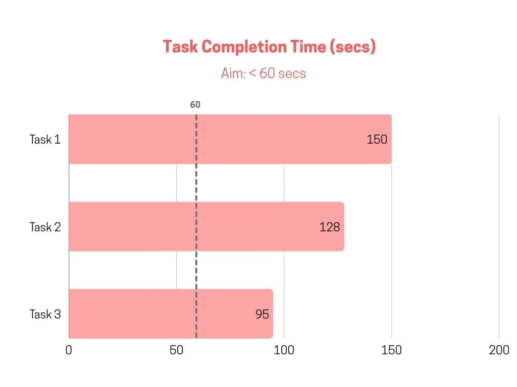
Task 1: book an appointment with a cardiologist , but users don’t have a preferred doctor.
Task 2: book an appointment with a cardiologist, but you have heard great things about Dr Bravo and would like to see her specifically.
Task 3: Book a follow up appointment with Dr. Bravo.
Before conducting the usability test, we selected three UX metrics to measure the results of usability tests as it showed us how users interact and engage with our products.
Results & Indication
Task Completion Rate: (number of people could complete the tasks)
Aim: >78% average completion task rate (Sauro, 2011)
Task Completion Time: (length of time users spend to complete each task)
Aim: booking process <1 minute
SUS Score: (online survey given to users to measure whether they like or dislike the product)
*To evaluate whether users like the product design, important element to determain the success of the product
Aim: >80.3 - Grade A ; >74 - Grade B (Sauro, 2016)
Grade B - Average of 75.8

The above result from the usability test were not ideal. However, on a positive note, we gathered valuable insights from users that helped us understand their experience!
These insights have allowed us to better grasp what users truly wanted, leading us to make key decisions to overhaul the entire search process.
Insights we have gained…
Apart from UX metrics, we also conducted interviews with users to understand what they think and feel about the experience. The below are the summary of their insights:
users expected to see the list of doctor right after choosing specialty/ specific doctor
users were confused about filter overlays
some users were unclear about the progress of the appointment. When asked to confirm the selected timeslot, they misunderstood it as the final confirmation of the booking
the re-book previous appointment userflow were not optimised by users. Most of the users book a follow-up appointment as a “new appointment”
Snapshots of Changes we have made after usability test…
Before - doctor search process

Users were confused by the search process despite the insights we gained from research.
After - doctor search process

Reduced steps for appointment booking.
Introduced optional filters for customization.
Added progress indicators for clarity.
Before - rebook appointments

“One-tap booking” was not optimised.
After - rebook appointments

added an additional page to ensures accurate direction of booking process
improved design on appointments box for more visibility
Apart from the above, there were other changes, such as the map, confirmation pages, had been made according to the result of the usability test.
Moving forward, we presented our mid-fi design to our agent, Creative Navy.
Our current design was what we suggest based on our research and usability test, aligning with the company’s goals:
Increase app uptake
Enhanced usability for a broad range of users
Faster booking process
We also suggested potential area for further development:
Iterating the filtering system once more data is available
Consulting with medical staff about appointment lengths for different contexts, as our user research indicated that appointment length is a common source of errors
Develop the ability to manage users’ subscription within the app
Consider additional features (i.e. a favourites list for doctors, integration with personal calendar for regular check-up reminders)
Reflection:
Deciding to change the entire search flow after the usability test was a real challenge for us. We invested a lot of time and effort into designing the initial user flow, incorporating filter options for users to narrow down their search results. However, the usability test reflects that users prefer to see the results—the doctor list—immediately after selecting a specialty, making the filter options less important than we anticipated.
I am proud that we have all prioritised users needs and feedback, it allows us pivot the design and create a truly user-centric product.
✨ Story time - While designing the filter page, I suggested adding "doctor experience" as an option, thinking it would benefit users seeking more experienced doctors. However, my teammates pointed out that this could lead to discrimination and might not be ethically appropriate. This feedback made me realise that, while I personally lean toward choosing more experienced doctors, the project must prioritise ethical considerations and the diverse needs of users. Although it was disappointing to have my idea rejected initially, I then fully understand the perspectives and appreciate this learning experience.